Refreshing the visual design of a virtual conferencing product
Bevy
UX and UI Design
February - April 2021
Background
Bevy is a community event engine with a purpose to bring people together, and they have a product that helps companies hold virtual events and conferences.
Project brief
Visual design refresh of their virtual conferencing product.
Role & Team
Sole designer with support from a product manager.
Discovery & Research
We interviewed the CEO and a Product Manager to learn about their vision, desires, and needs for the product’s new look and feel. The interview was centered around the following questions:
- What differentiaties Bevy from other products in market?
- What UI attributes should the product embody?
- What interfaces inspire you?
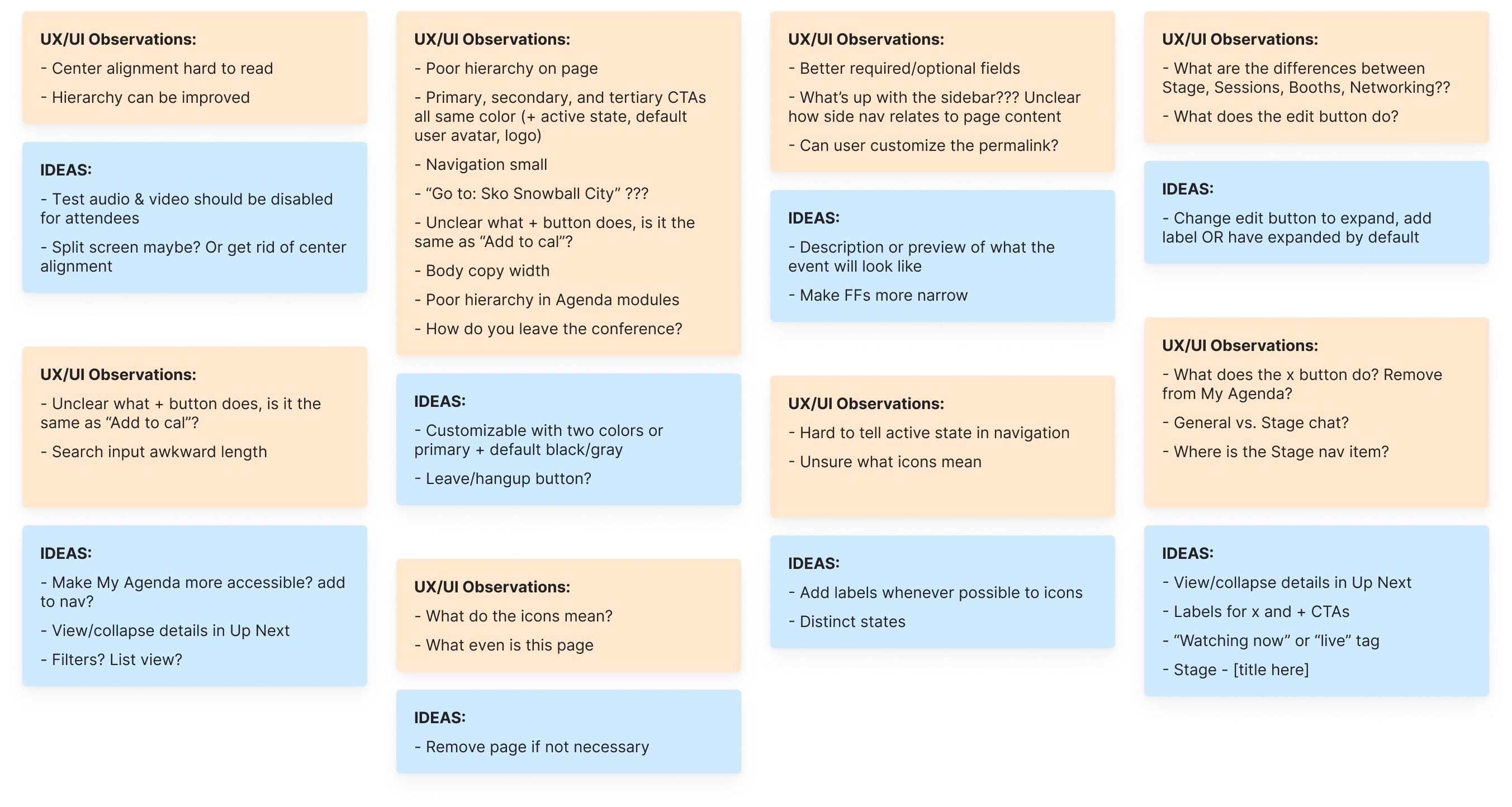
Afterwards, we worked with the client to define product requirements and constraints; conducted competitive analysis; and ran an audit of the current product for UX and UI issues along with potential improvements.

UX and UI observations made during the product audit
Design Concepting
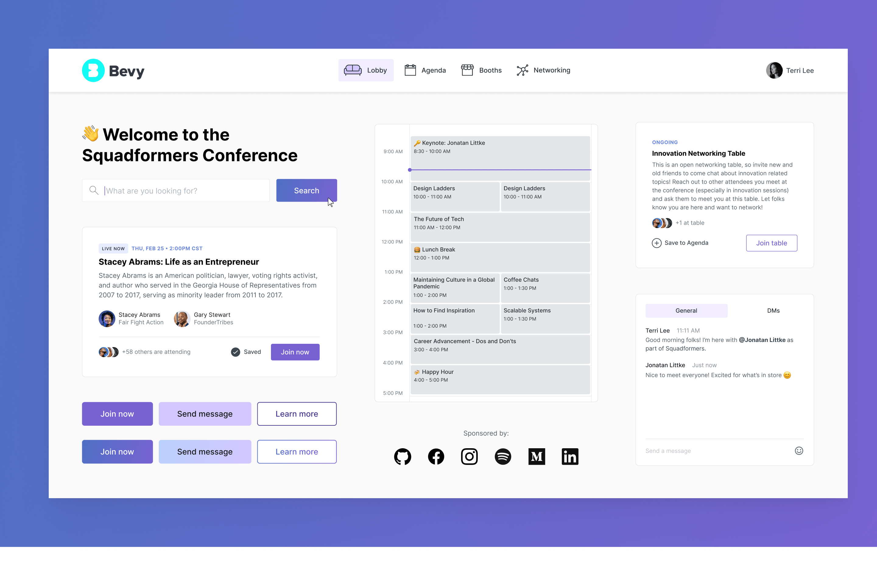
Using the desired UI attributes from our stakeholder interview, I created a stylescape to demonstrate what the visual design of the product could look like. These were the adjectives I used to create my stylescape:
- Simple
- Cool
- Flexible
- Clean
- Friendly

Notifications and Chat
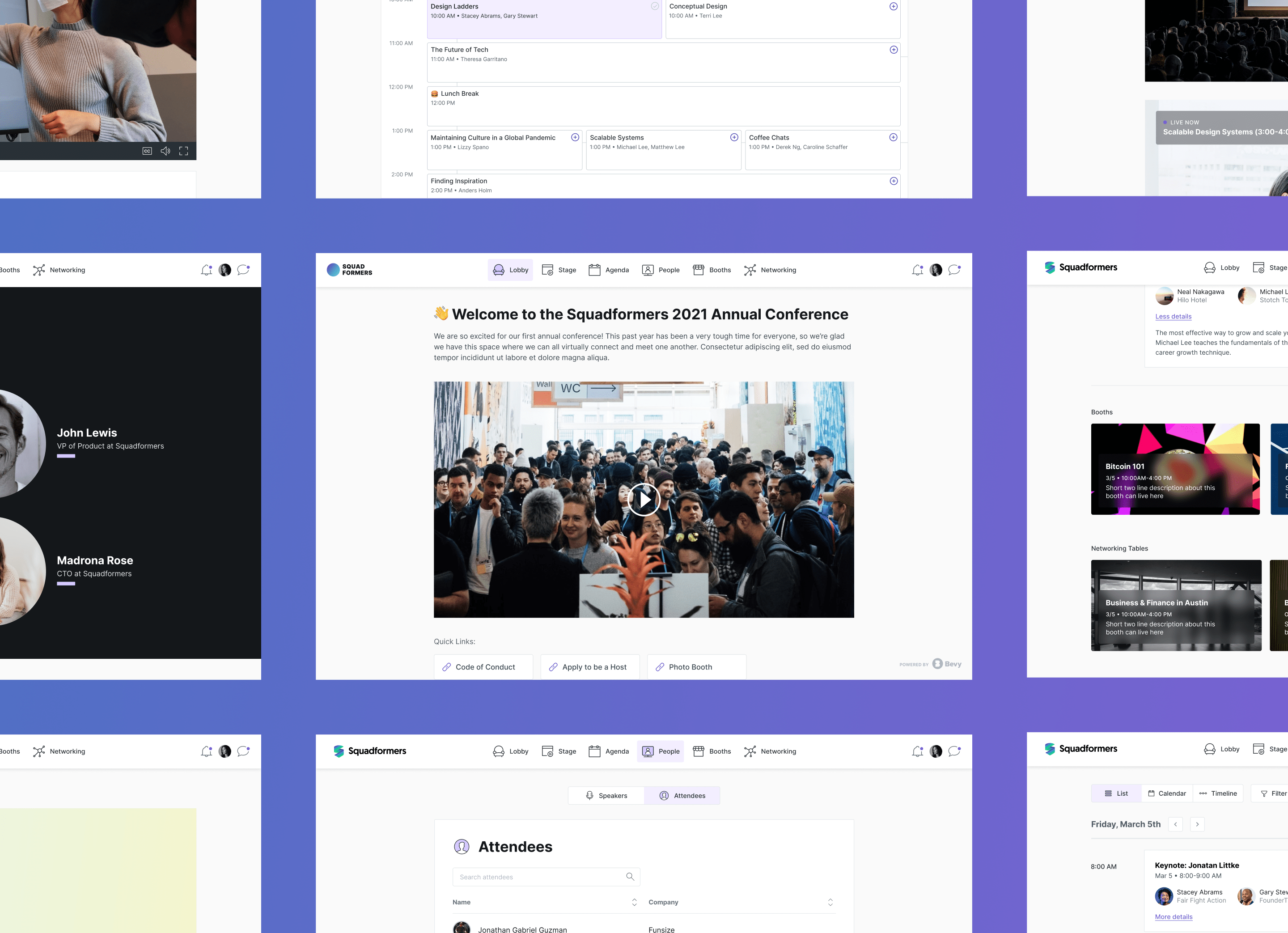
One important task we took on with the redesign was reworking the Information Architecture so that users would better understand where they were in the product and be able to easily navigate from one area to the next, as one often does at in-person conferences.
We also gave special attention to the notification and chat features within the product since they help attendees, speakers, hosts, and admins communicate in real time with one another, another crucial aspect of conferences and networking.
The chat feature needs to be globally accessible for the user to access the general chat, their DMs, and participate in Q&A sessions
Agenda
The Agenda is an important part of the product because attendees frequently refer back to it to see which talks and events they’d like to participate in.
The existing Agenda was difficult to access and read, giving users a terrible experience. We worked on making it simple, clean, and dependable, as this seemed like an area where relatively low effort could result in high product impact.
In the new design, attendees can switch between Agenda views, add events to “My Agenda,” view important event information at a glance, and view more details with one click.
This Agenda gives attendees more control over how they’d like to view their conference schedule in addition to providing more information at a glance
Stage and People
The bread and butter of the product, the stage is where attendees go to hear speakers talk! To improve this area, we cleaned up the UI, added important video controls such as ability to adjust the volume or turn on closed captions, and added contextual information about the talk.
In the existing product, Attendees is nested within the chat feature making it hard to find and interact with. We felt the attendee (and also speaker) list should be given higher importance so we added People as a primary navigation item. Here, anyone can learn more about the keynote speakers, featured speakers, and attendees, and we added the ability to search and DM from the page as well.
Adding in simple features like video controls and tags can help transform the user’s conference experience from frustrating to delightful

Conclusion
Working on the redesign of this virtual conferencing product was really fun and I loved having complete creative control throughout the process. Bevy is doing some great work, and this product is especially relevant as we’re all moving more towards virtual/remote life and online communities.
I’m a designer with a focus on interaction design and UX based out of Austin, Texas. I’ve worked with clients ranging from small startups to global companies and on products including mobile apps, marketing websites, and software.