Designing new features to help users improve their credit score
Credit Karma
Product Design
May - December 2021
Background
Credit Karma, an Intuit product, is a free credit monitoring tool in order to help their members achieve financial freedom. They introduced their banking product, Credit Karma Money, in 2020.
Project brief
Design new features for Credit Karma Money, optimize the Credit Karma Money funnel for tax season, and assist in documentation of Credit Karma’s design language system.
Role & Team
Senior designer. Team of 3 Funsize designers embedded with the client’s team of product managers, engineers, and designers.
Intuit now owns both TurboTax and Credit Karma, and they leverage this by promoting Credit Karma’s banking product (Credit Karma Money) as a tax refund method during tax season.
There is a large effort to optimize CKM’s signup flow in preparation for tax season as this is the most traffic CKM sees all year. I worked closely with my PM to create 10+ experiments for testing ahead of and during tax season. Below are some examples.
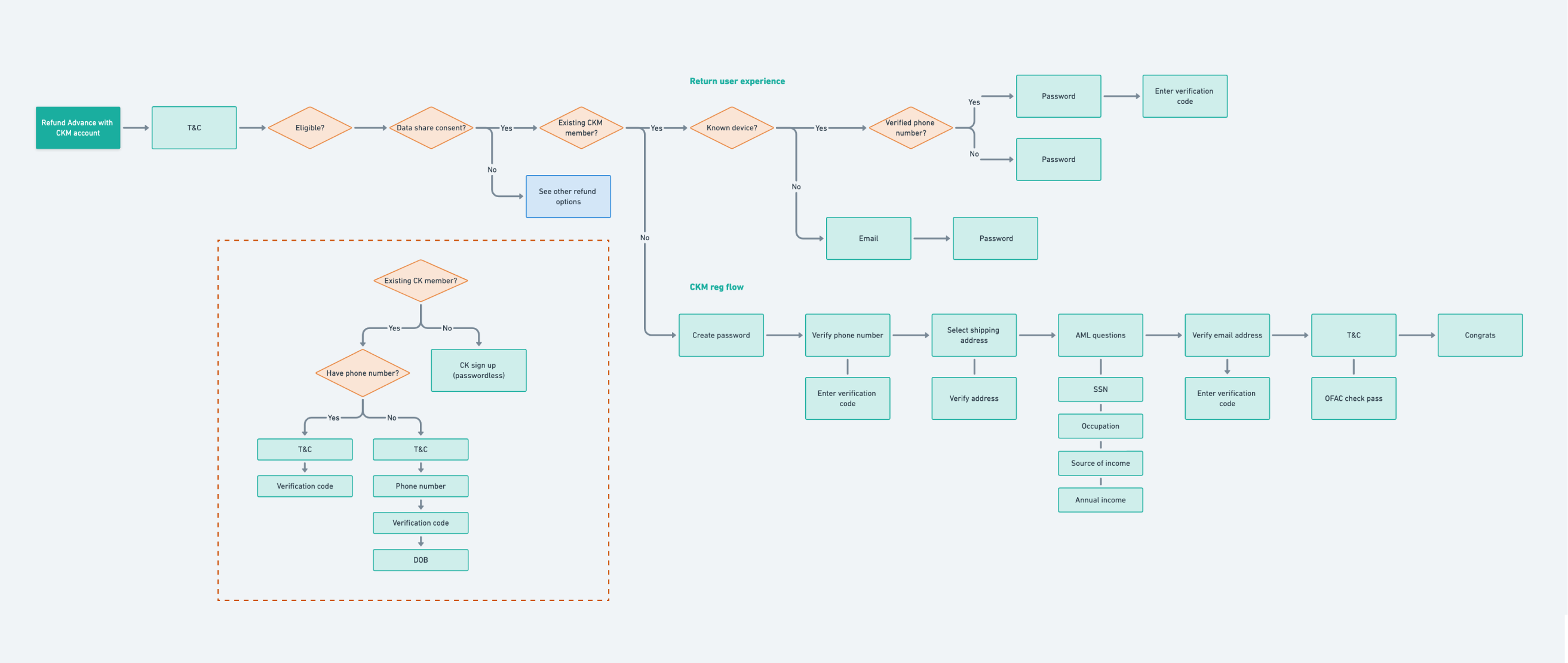
Creating user flows to inform our wireframes
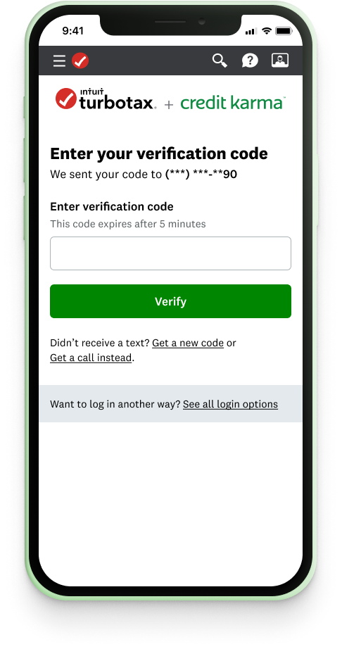
Control
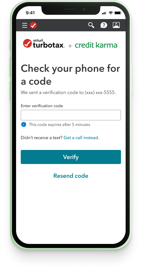
Challenger
Experiment: Applying TurboTax DS to Credit Karma screens
Users are unclear on the relationship between Intuit/TurboTax and Credit Karma, and think Credit Karma is a third-party upsell.
Hypothesis
By styling Credit Karma Money screens with TurboTax’s design system, we will facilitate a stronger mental connection between TurboTax and Credit Karma, leading to estimated 5-12% lift in units.
Variant 1
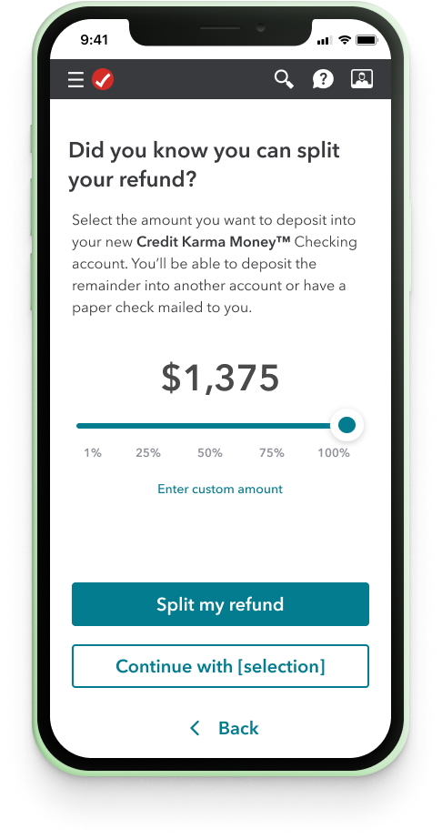
Variant 2
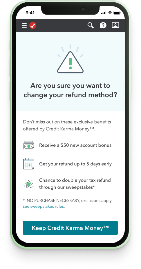
Experiment: Introducing an abandonment screen
33% of members who open a CKM account end up not getting their refund deposited into CKM. Reasons include no refund accepted, they change it when they return to TurboTax, etc.
Hypothesis
After a member switches from CKM to another refund method, we display an abandonment confirmation screen reinforcing the exclusive benefits available only via CKM to mitigate abandonment rates.
Control
Challenger
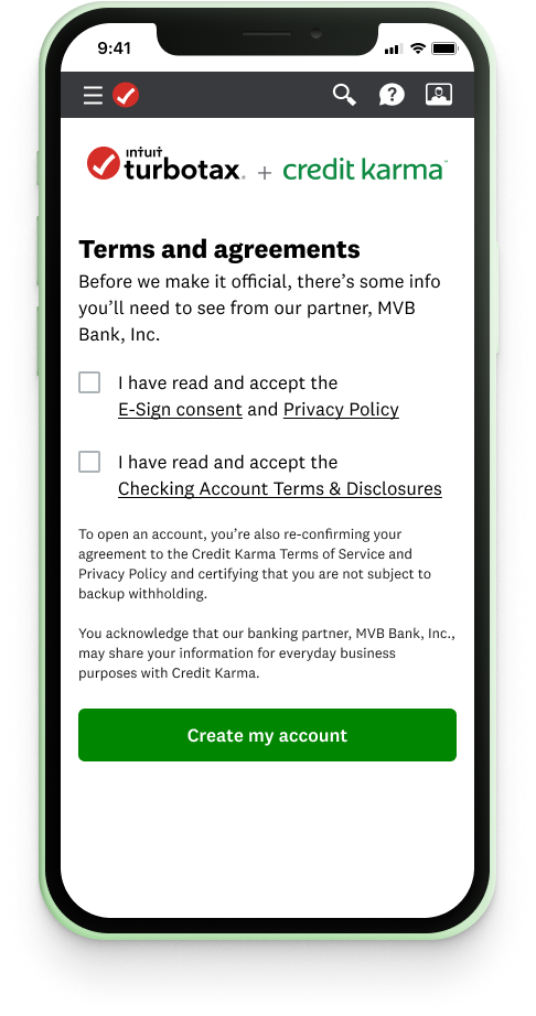
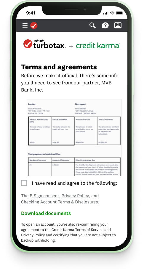
Experiment: A more accessible T&C screen
When users reach the T&C screen, some may accidentally tap the disclosure link instead of the checkbox because of their close proximity to one another.
Hypothesis
Consolidating the T&C into one checkbox and listing the disclosures on a separate line will help the user move more easily through this page.
Score Improvement &
Bill Pay
CKM’s Score Improvement and Bill Payment feature, launched in Jan 2022, helps members improve their credit score by providing bill payment tips. I supported the lead designer for this effort, working on designs, user testing, and design iterations.
Our product team worked with a researcher to hold 12 moderated user interviews focused on the question: Can users comrephend the score tip and understand how to use it?
I helped in moderating interviews, note-taking, and research synthesis. After interviews were complete, we prioritized our findings to help guide the next round of design iterations.
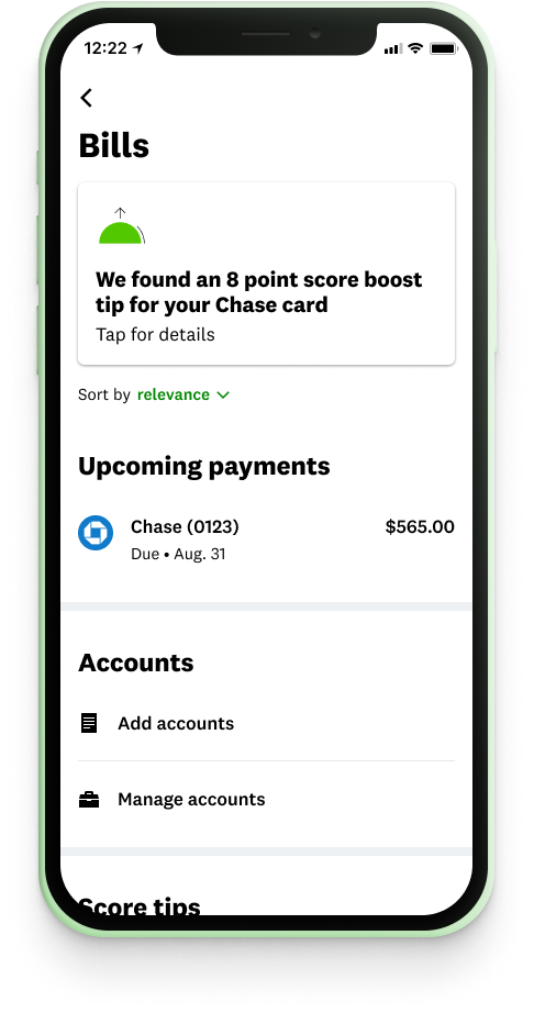
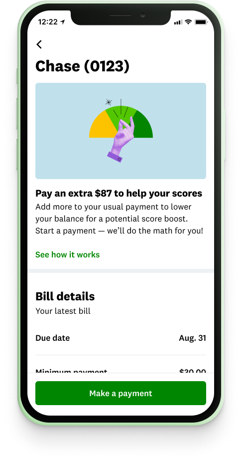
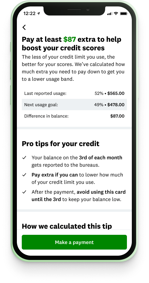
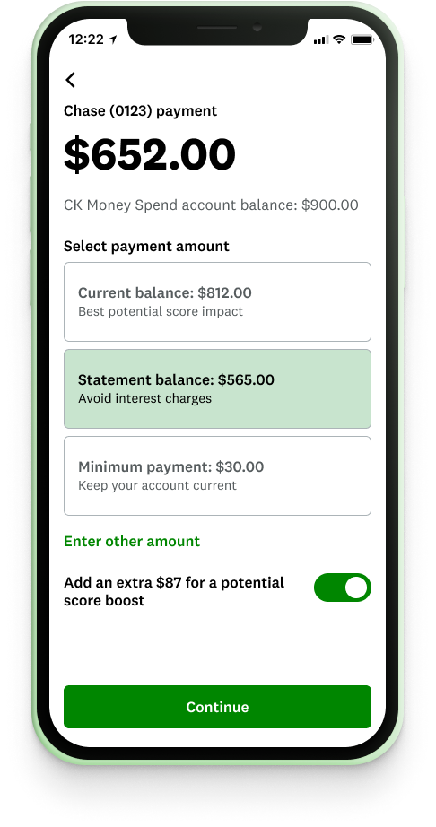
Selection of screens used for user testing
Karma Product Language
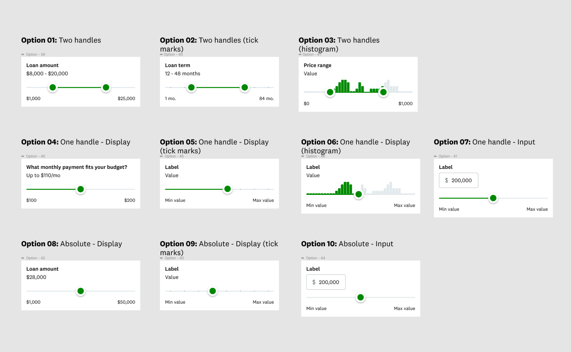
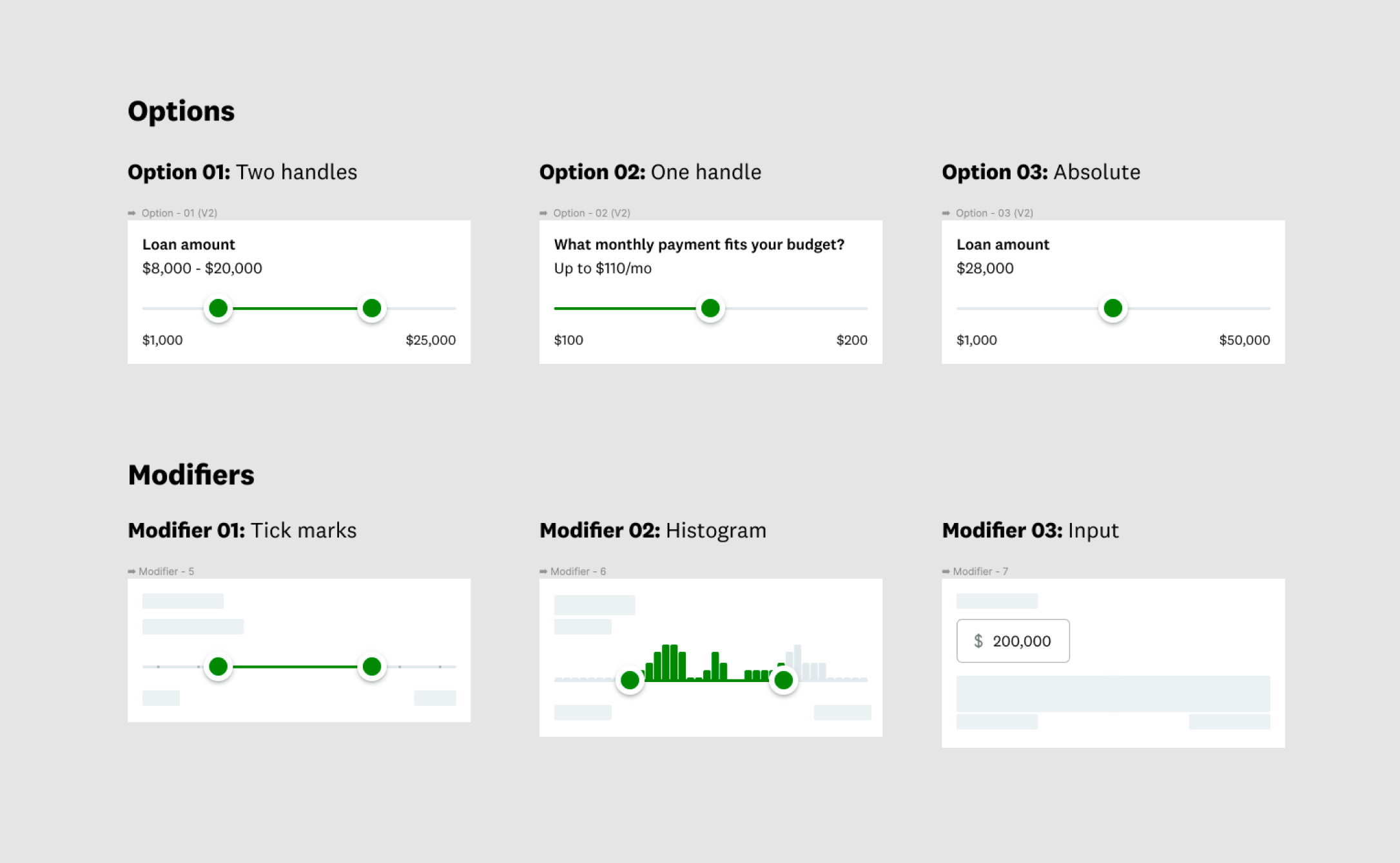
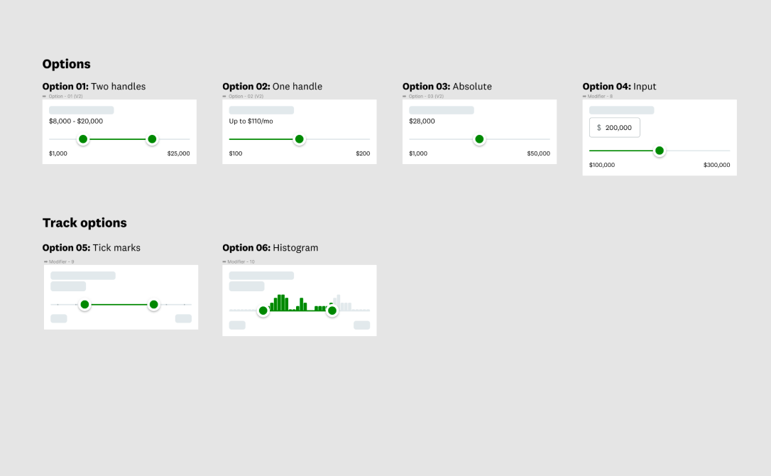
The Funsize team worked for two months helping document Credit Karma’s robust design system, Karma Product Language. A few of the documentation sections we worked on included outlining component anatomy, listing component options/variations, and finding in-product examples.
The biggest challenge in this project was setting guidelines that would apply uniformly to all components considering the complexity and wide range of use cases across the product.
Different approaches we had for how to display the options for one component
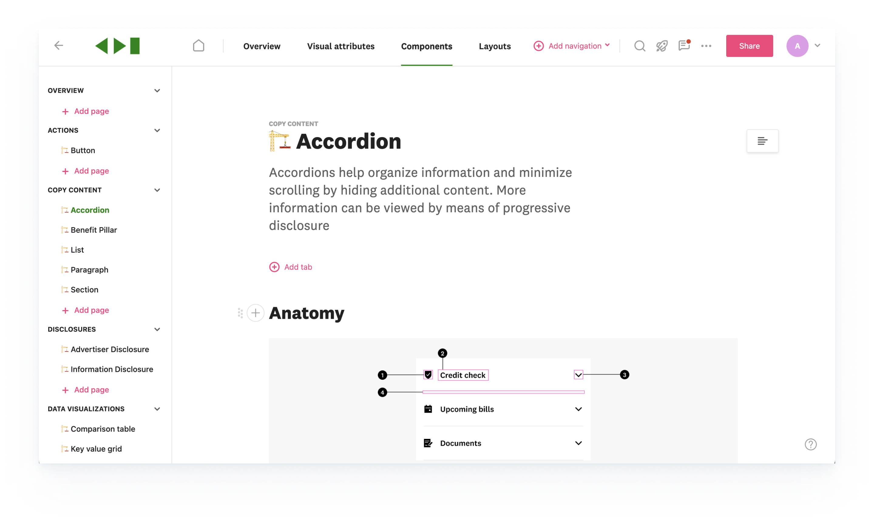
Component page in ZeroHeight, the new documentation tool
Conclusion
Credit Karma Money is growing quickly since launching in 2019 and they’re doing some cool things to reimagine the banking experience. It was great to work with them at a high pace and be involved in so many aspects of their product. Keep an eye out for what they do next!
I’m a designer with a focus on interaction design and UX based out of Austin, Texas. I’ve worked with clients ranging from small startups to global companies and on products including mobile apps, marketing websites, and software.
