
Transforming the consumer web and mobile experience through user to user connection and an improved interface
Duration
April - November 2022
Role
Senior Designer

Background
Peloton changed the fitness industry with their stationary bike. Today they offer a variety of live and on-demand workout classes on their hardware and through their mobile app.
Project Brief
Design new features for the Peloton mobile app and web experience to bring fitness and motivation to members anytime, anywhere.
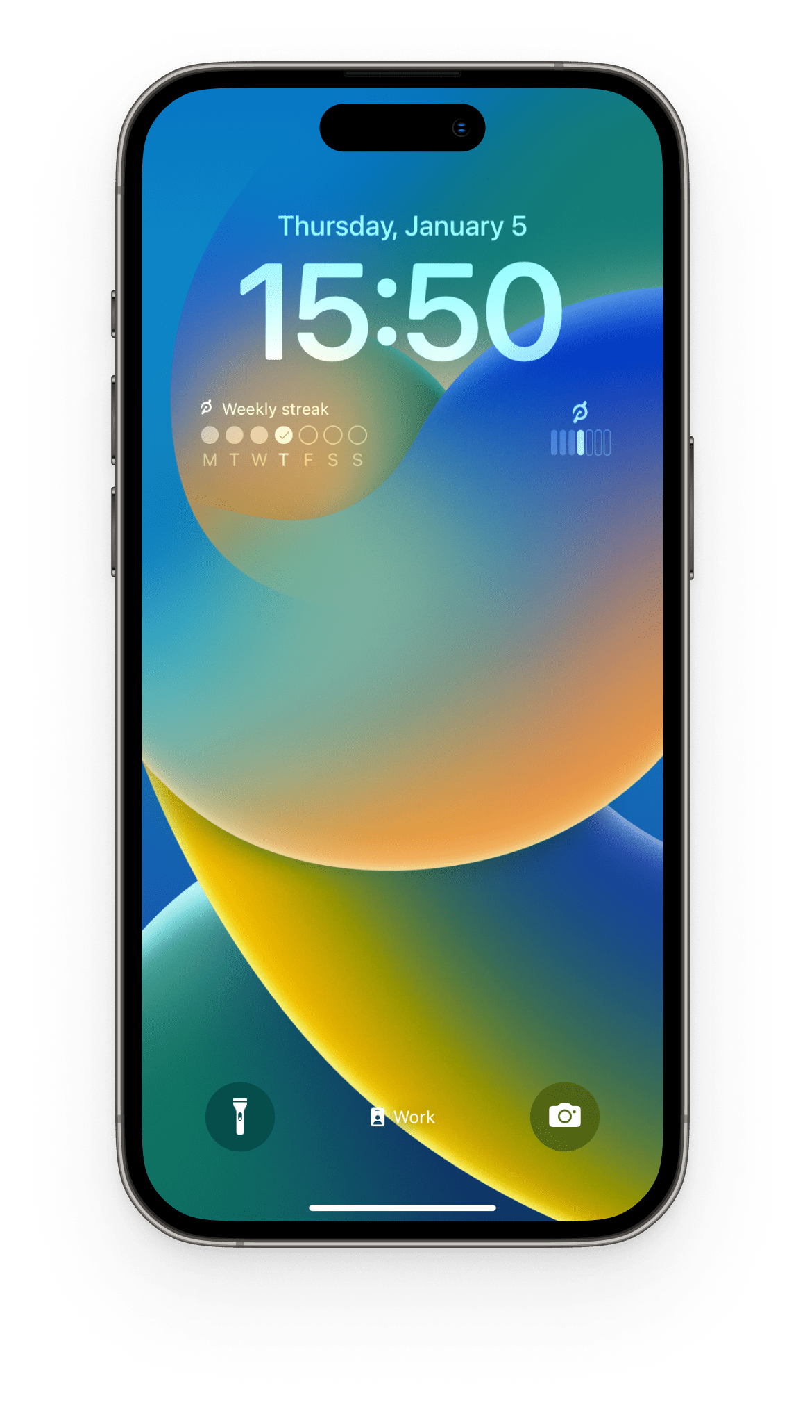
Lock Screen Widget
Widgets were introduced to the lock screen as a part of iOS 16 in late 2022. We utilized this opportunity to design a simple and useful widget to increase engagement with the Peloton app.
I designed both versions of the widget and worked with eng to launch in time for iOS 16. My work was promoted by Apple in the App Store on their “Favorite lock screen widgets” list.
Project Goal
Remind users of their weekly streak to motivate them to their next workout
KPIs
Increase avg # of weekly workouts taken
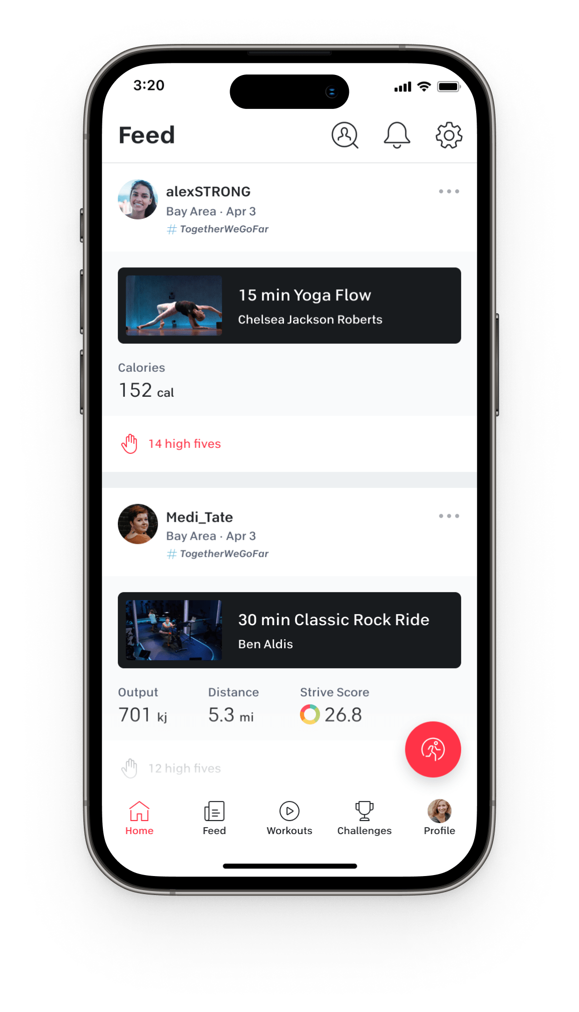
Activity Feed
One of Peloton’s main value propositions is the community and motivation it provides to its members. We embraced this mindset when designing the all new Activity Feed, a social feed where members can view and interact with their friends’ workout activity.
Project Goal
Increase community interactions and content discovery
KPIs
Increase DAU and MAU
Homepage Redesign
The existing homepage design looked dated with its dark grey background and styling, didn’t provide an easy way to access key user content, and overwhelmed the member with the amount of content on the page.
We prioritized features that would help us meet our goal of facilitating better content discovery and navigation to important tools. This included a new navigation, a more robust personal activity header, and an all new commitments panel on the right.
Project Goal
Improve content discovery and activity management
KPIs
Increase DAU and MAU
Results
150% increase in weekly sessions and 20% increase in feature usage growth from improved navigation
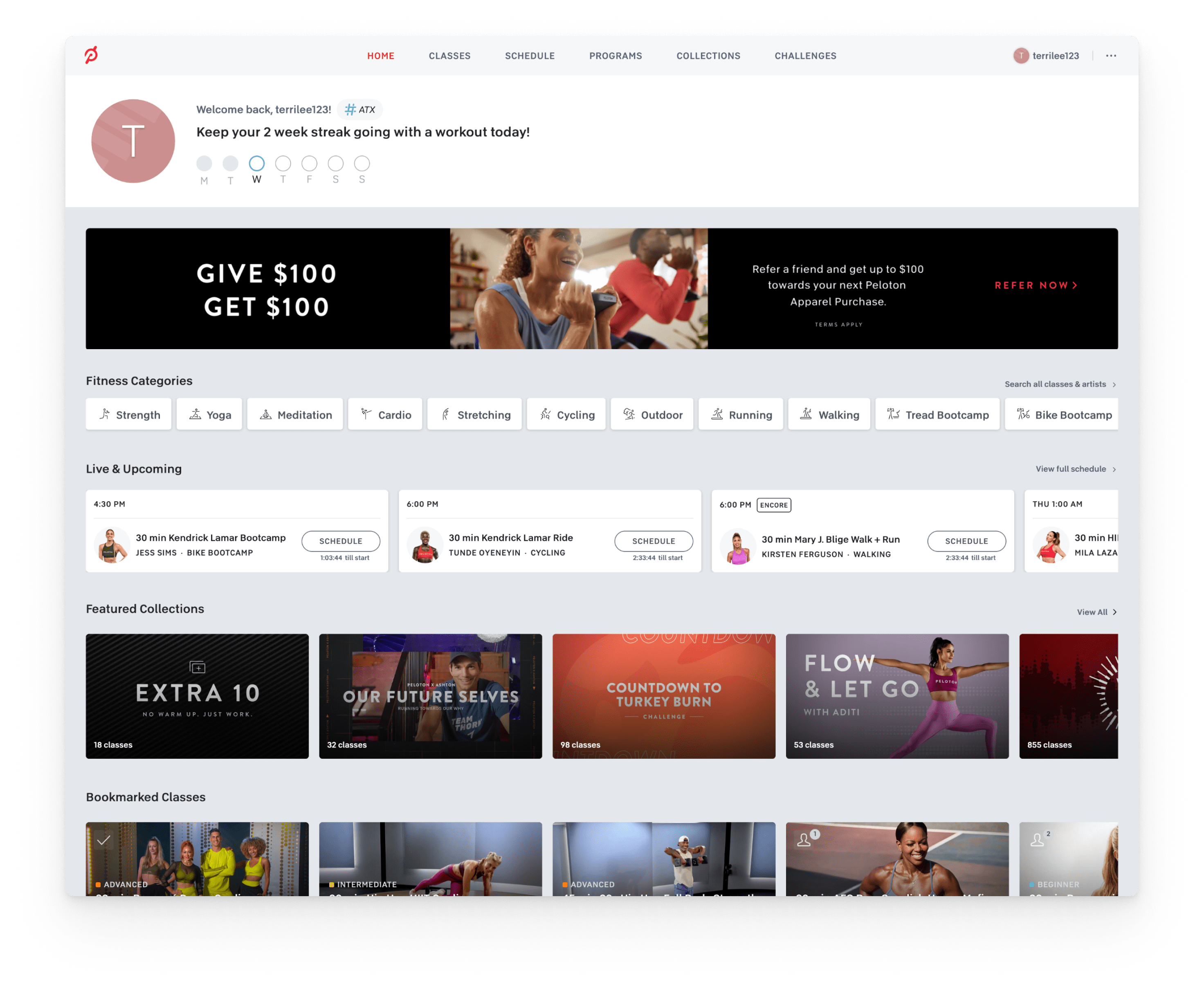
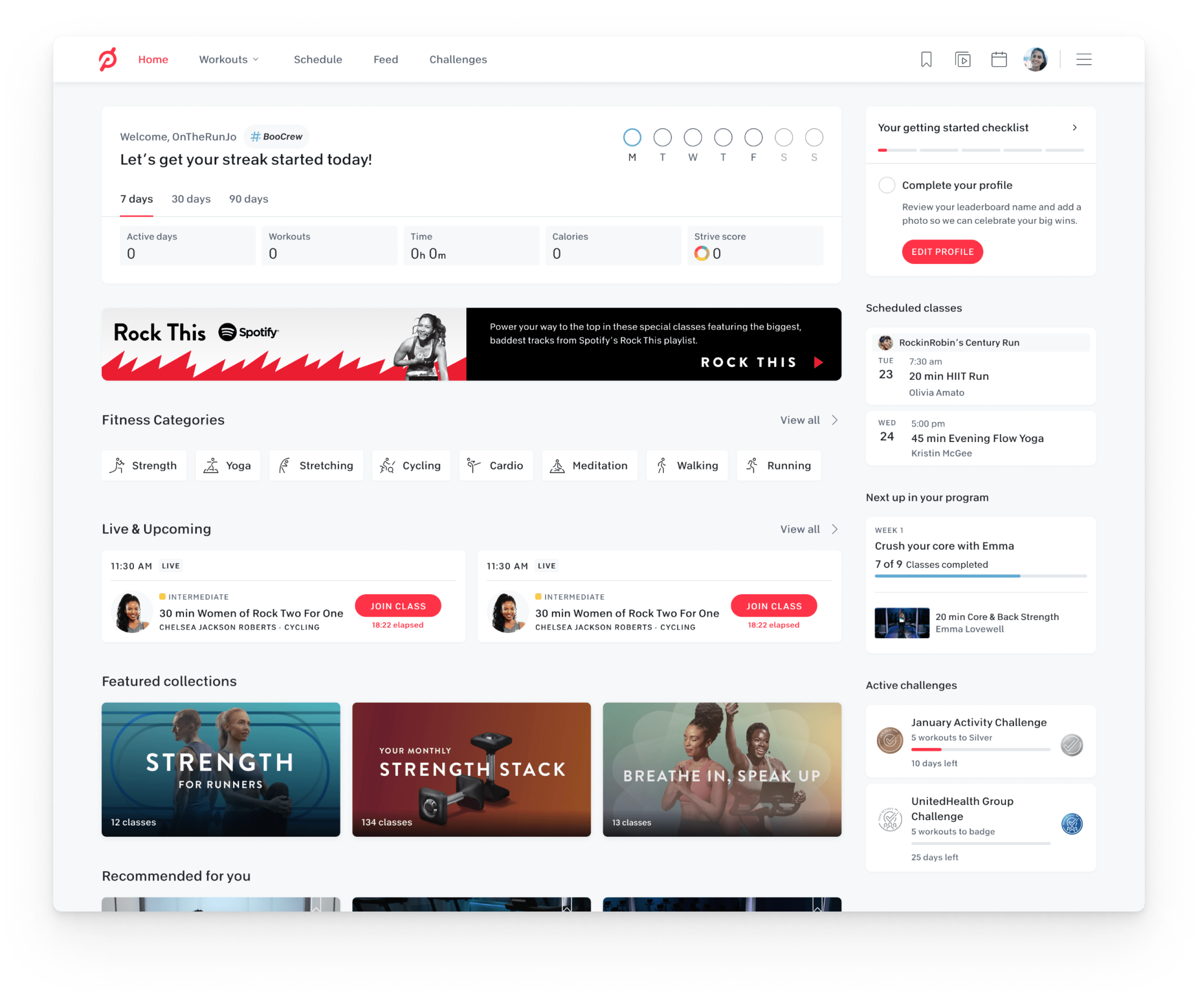
Old member dashboard (left) vs new member dashboard (right)
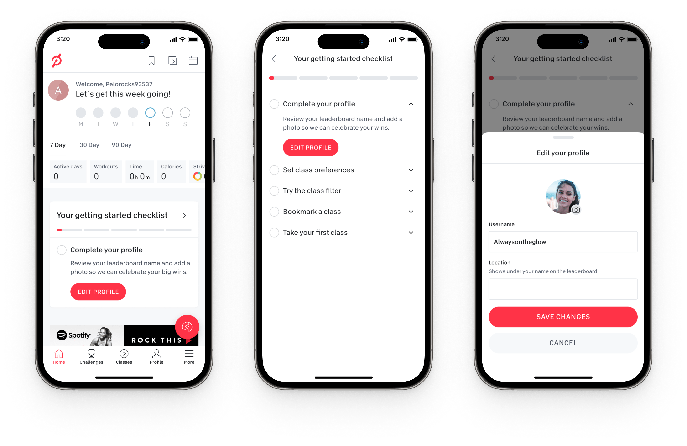
Onboarding Checklist
Peloton has been working on a number of efforts to include more gamification in their app. One of the first efforts to launch will be the Onboarding Checklist which I designed. The checklist will be a part of the new member’s onboarding experience and will highlight important features and encourage community engagement.
Project Goal
Increase feature discovery and usage
KPIs
Increase DAU and month to month retention

I’m a designer with a focus on interaction design and UX based out of Austin, Texas. I’ve worked with clients ranging from small startups to global companies and on products including mobile apps, marketing websites, and software.