Volvo Cars
Product Design
November 2018 - February 2020
Background
Volvo Cars is a Swedish luxury car brand with international reaches looking to modernize its web experience and bolster their car subscription service.
Project brief
Volvo’s new car subscription service, Care by Volvo, is launching in several new countries and they need to optimize their sign up experience. Additionally, Volvo Cars’ website is outdated and doesn’t match the modern brand image they want to convey.
Role & Team
Product Designer. Team of 3 Funsize designers embedded with the client’s team of product managers, engineers, and designers.
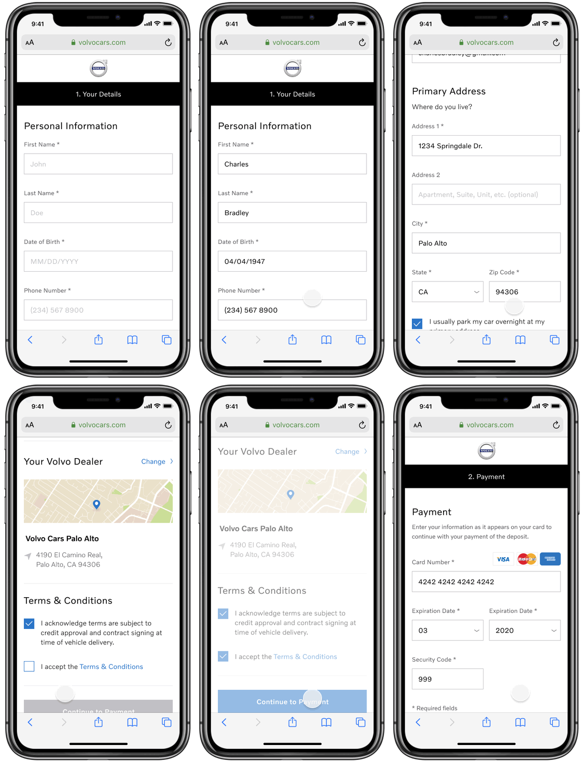
Care by Volvo
Volvo’s car subscription service is used by thousands of drivers in the USA, Norway, Sweden, Germany, and more. I helped design an automatic credit check experience as part of the CbV checkout flow and also helped mature the mobile app to be more seamless and similar to the web experience.
.Com Redesign Roadmap and IA
I was part of a larger effort to redesign the volvocars.com website from the ground up and contributed to the following alongside the design team and multiple product teams:
- Roadmap and strategy for rollout
- New site information architecture
- New design language system
- (Re)designed existing and new pages
- Prototype creation for presentations and user testing
- Research and user testing
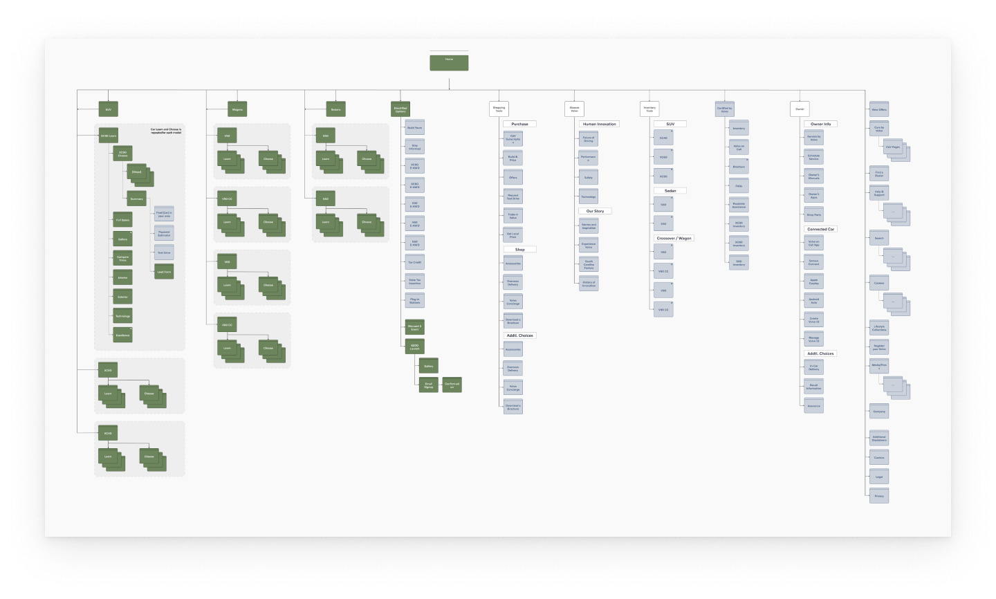
One of many site maps developed for the site redesign
Landing Page
The biggest initiative in this project was creating a new landing page. With a new look and feel, we wanted to showcase Volvo Recharge, a new line of electric and hybrid cars, while also giving visitors a way to view other powertrain offerings (i.e. gas vehicles).
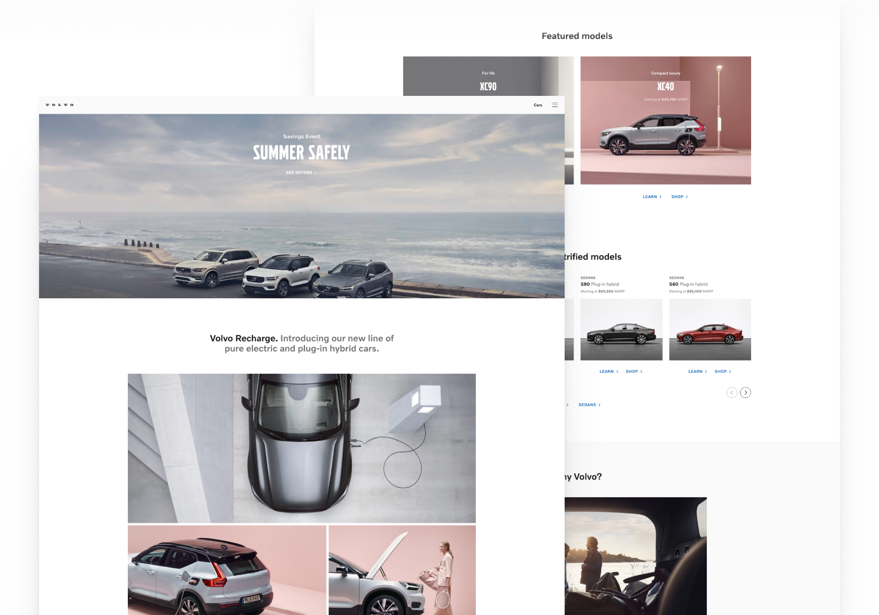
Volvo Cars landing page
Car Configuration
The car configurator is an integral feature to the website; it gives visitors to the site an interactive opportunity to explore Volvo’s latest car models and customization options.
To optimize for the mobile experience, we designed the configurator as a one page layout that would snap to the next section on scroll. The design of the configurator needed to accommodate many languages and we had to create a design that would hold up against market-specific offerings. For example, one model might have 3 trim options in the US but 5 trim options plus additional upgrade options in Germany.
Another challenge in this project was that we did not have an established design system to work from as our new design system was being created in parallel workflow.
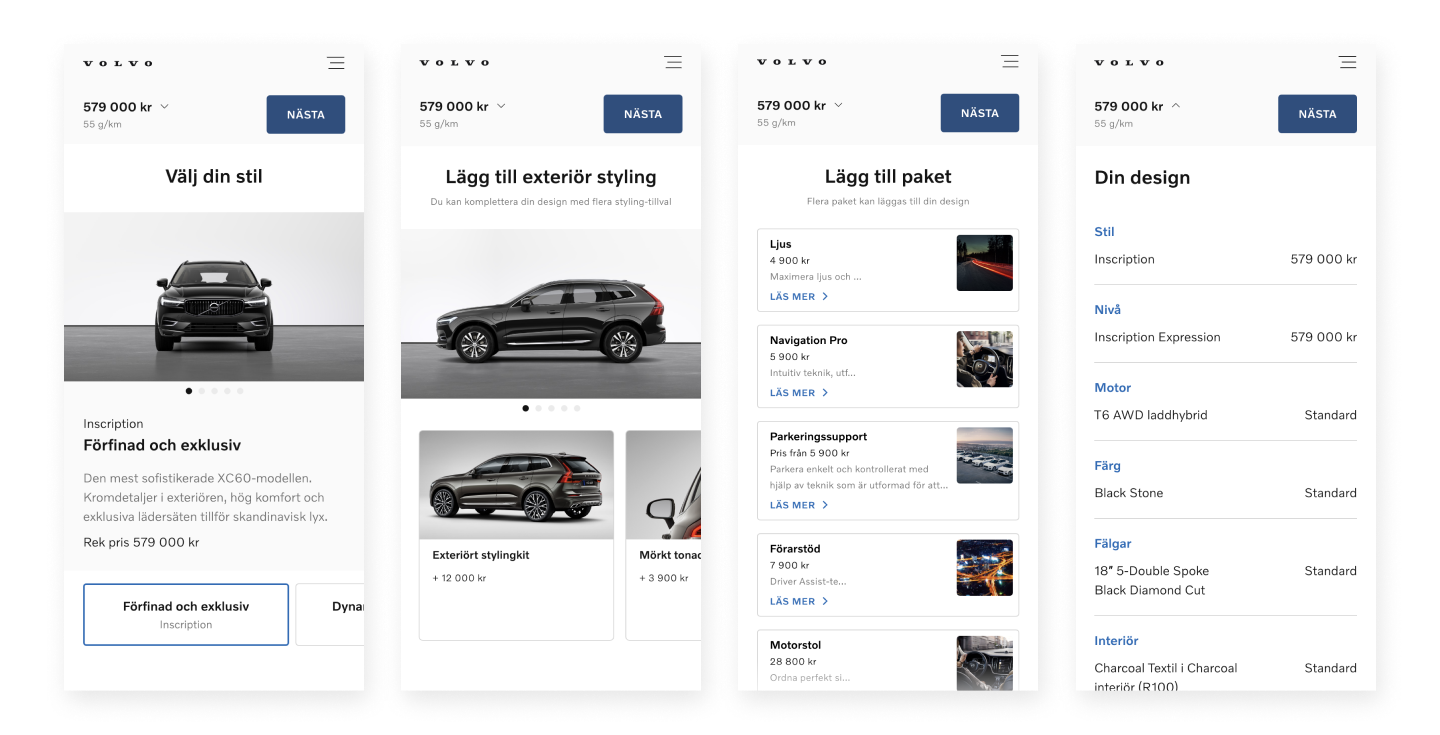
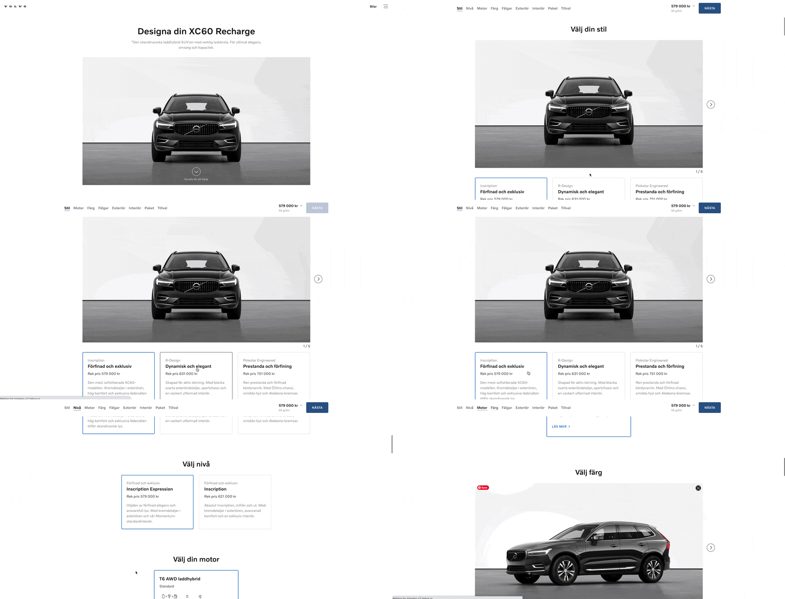
Volvo Cars Sweden car configurator
Configuration Summary
As the lead designer for this effort, my task was to design the Summary screen the user sees after configuring a car. This summary needs to include an overview of their selections along with a sticker sheet of all the car features, pricing options (which vary by market), and nearby test drive suggestions.
To solve for the challenge that different markets have distinct offerings, I conducted an audit across Volvo’s primary markets for their primary, secondary, and tertiary CTAs; what pricing options were available; and catalogued any edge cases (spreadsheet below). I used this to determine which CTAs were most common across a majority of the markets, and to ensure my design would be flexible to accommodate for all use cases.
I also created a Pricing Module Template for the development team to help guide them in how prices, labels, CTAs, and disclaimers should be displayed depending on market variations.
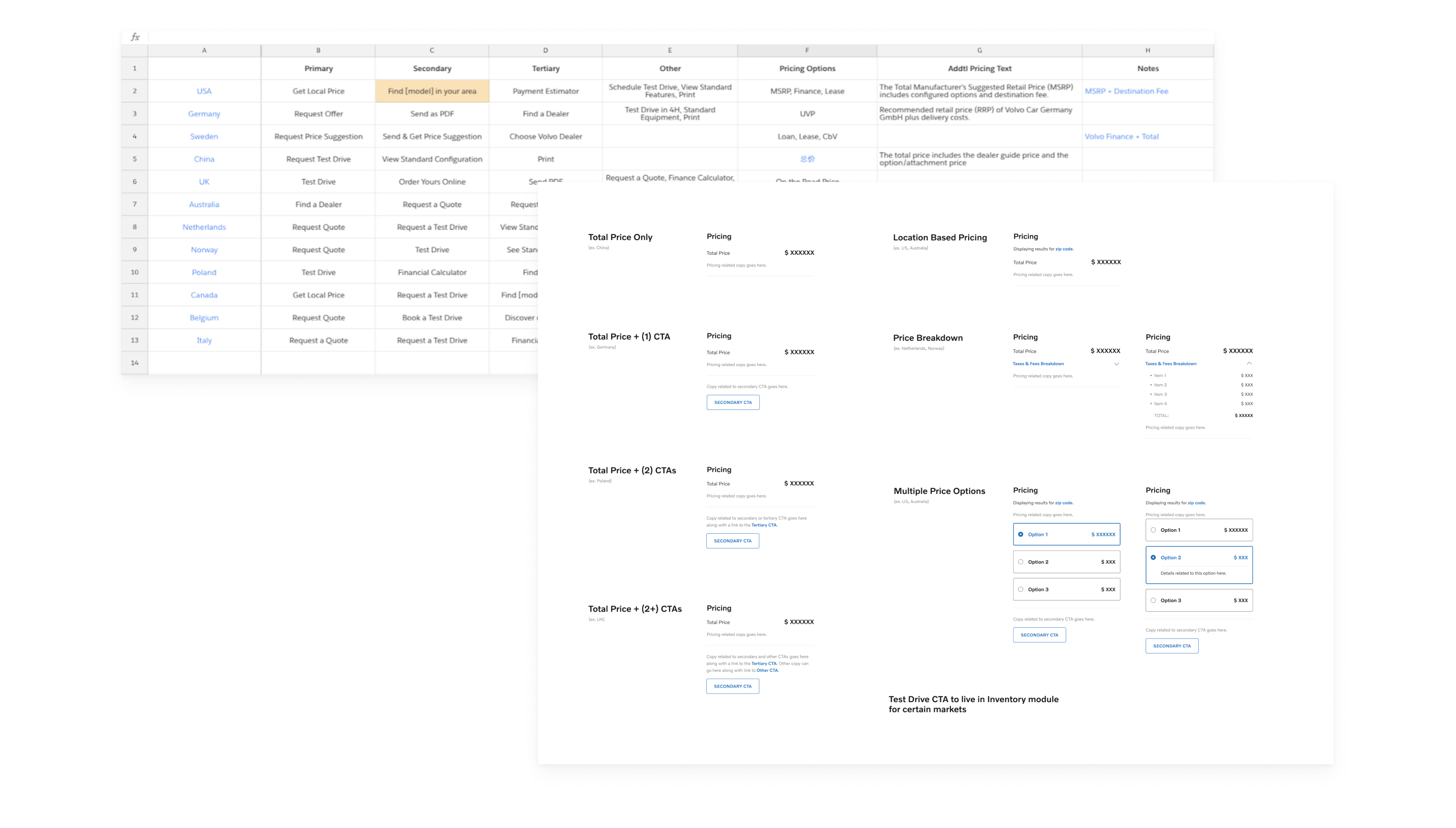
Challenges I tackled on this page included determining hierarchy of information on the page; how to group, present, and allow edits to the user’s selections; and consideration of various purchase paths for each market.
I designed a preliminary Summary screen to go into user testing. To prepare for this, I wrote a user research testing script. Volvo’s internal research team conducted the testing, and from their presentation, I compiled findings and derived problem statements to guide my next iteration of the design.
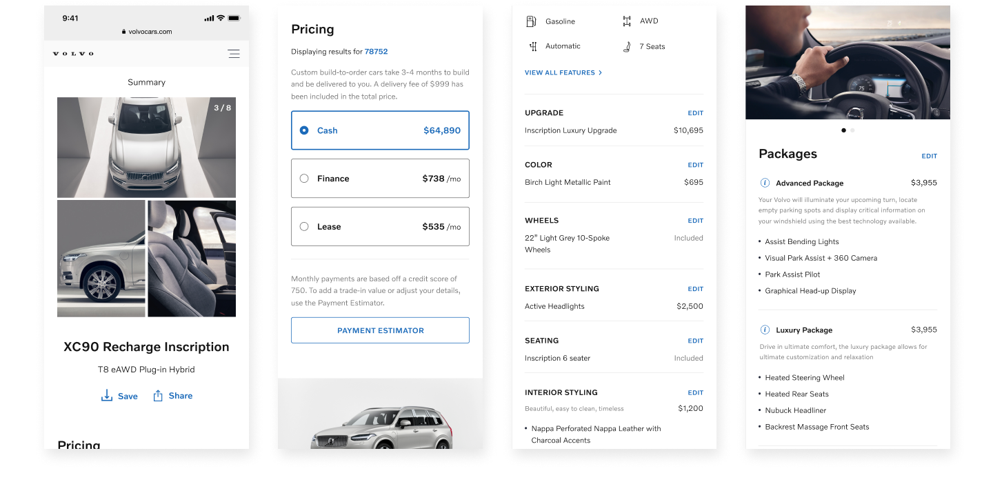
Configurator mobile screens
Conclusion
Volvo Cars successfully launched their new website in 2020, and the Care by Volvo subscription program is still going strong.
Designing for an international brand came with its own unique set of challenges. As Volvo has 120+ markets and 80+ languages, I learned the importance of thorough design documentation and gained great experience designing with flexibility as a priority.
I’m a designer with a focus on interaction design and UX based out of Austin, Texas. I’ve worked with clients ranging from small startups to global companies and on products including mobile apps, marketing websites, and software.